Interdisciplinary collaboration and good partnership working - reflections on going Wild with Manchester Museum
In the first half of 2024, FF worked with Manchester Museum on a digital interactive for their new exhibition, Wild. The process was smooth - and more importantly, fun and interesting. Here we dig into what makes a good collaboration... and what we learned.
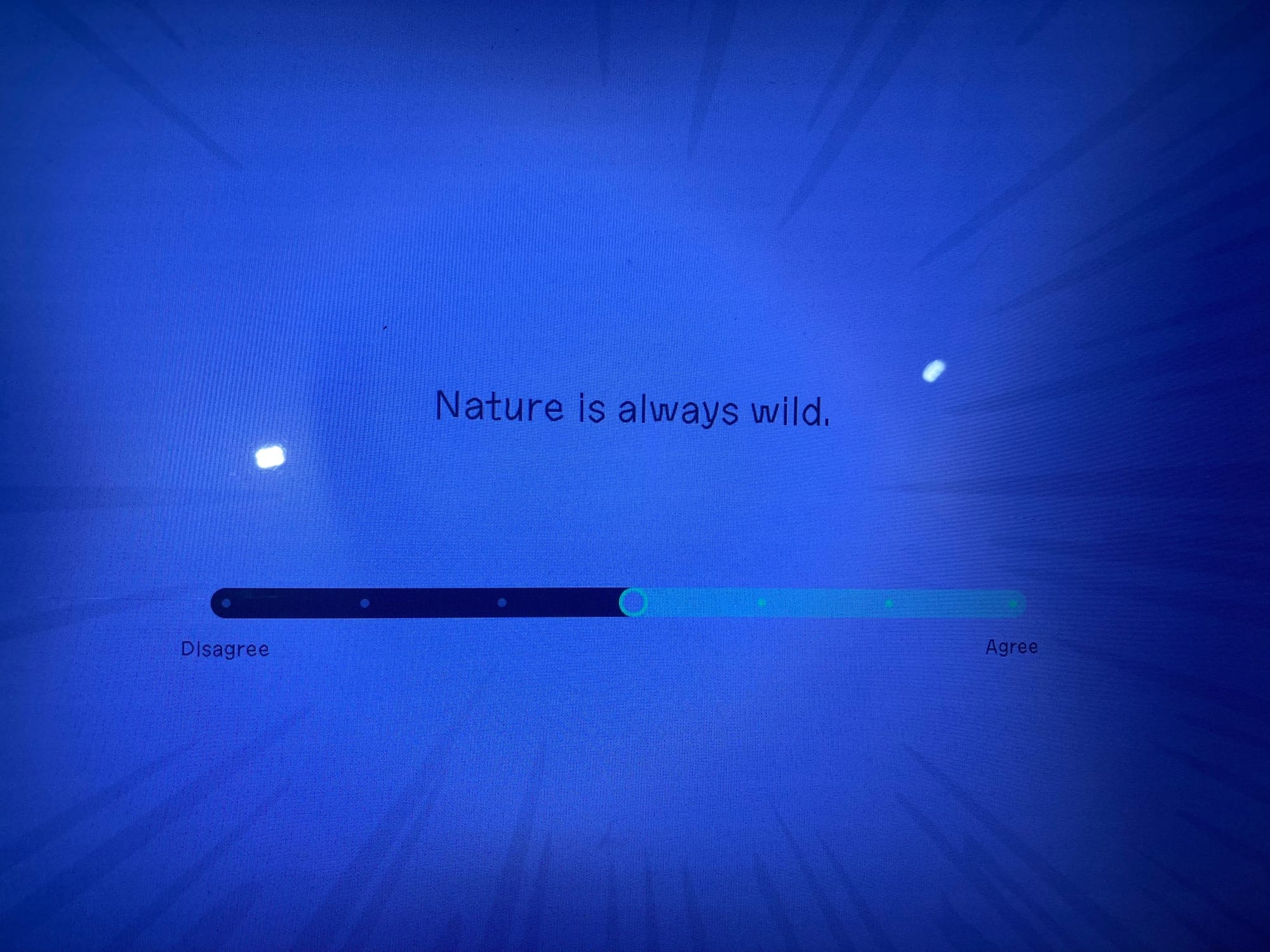
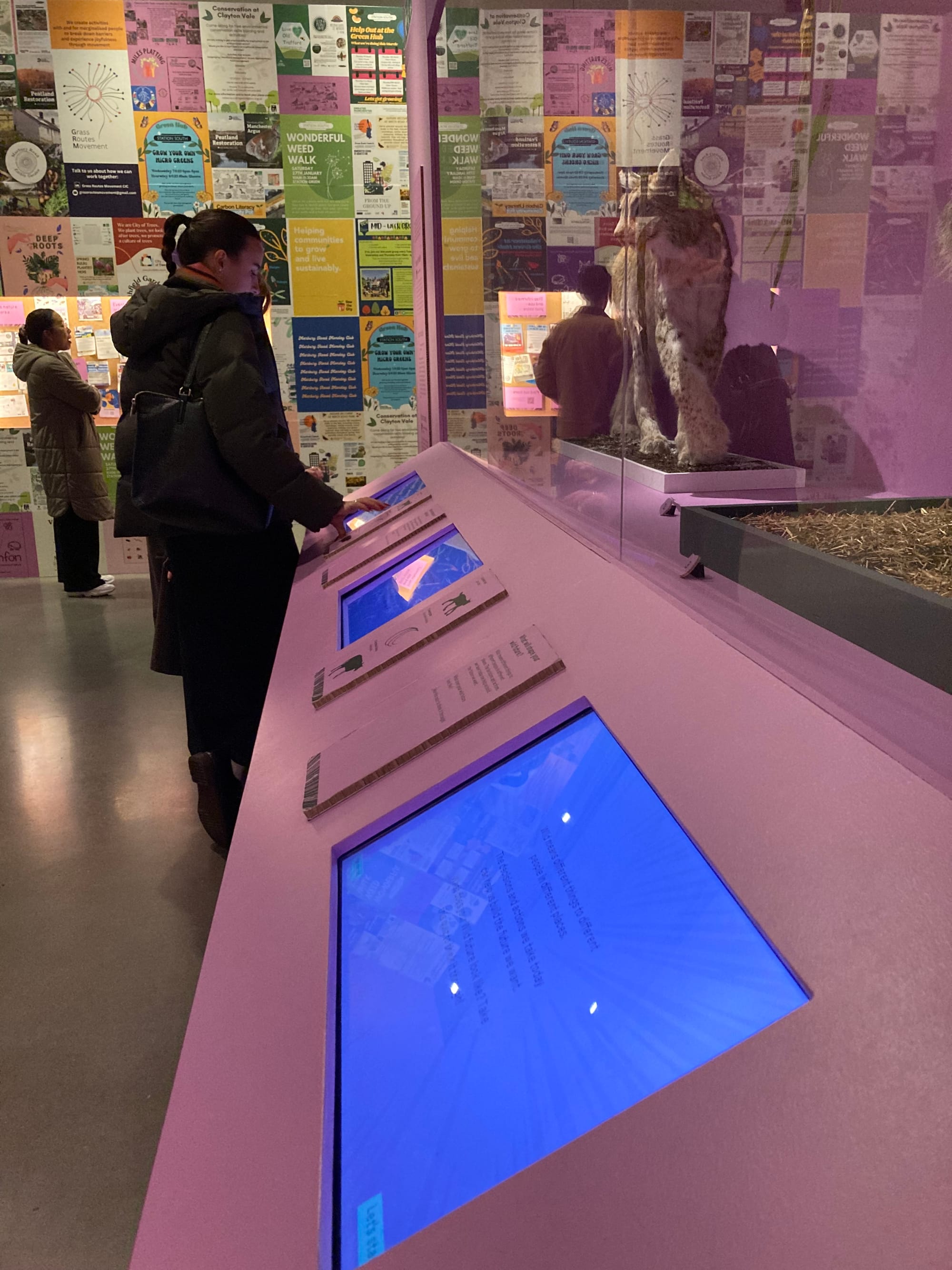
In the first half of 2024, FF worked with Manchester Museum on a digital interactive for their new exhibition, Wild. We ended up making a personality-test style quiz to help visitors explore how personal values shape perceptions of nature and wildness, and a dynamic data visualisation projection that showed their responses. The process was smooth - and more importantly, fun and interesting. We’ve had a couple of tricky projects recently so we thought it was worth reflecting on why this was such a good collaboration - and also the things we learned.
I (Rachel, FF CEO and writer on this project) am going to refer to some people in this piece:
- Joe, FF’s CTO, who masterminded the tech behind the project
- Mirko, who worked as tech associate, focussing on the projection
- Alex, Acting Deputy Head of Collections & Curator of Indigenous Perspectives at Manchester Museum, who kicked off the project
- Hannah, Curator of Learning at Manchester Museum, who took over as project lead when Alex took a different role
Why it worked aka top tips
- Work with a clear brief/ leave space
When Alex and Hannah got in touch about the project, they were really clear about the role that they wanted the interactive to play within the exhibition. They had no idea about what it should look like or do. For me, this is perfect - our job is to figure out how to fulfil the need that’s been identified. The worst projects are where someone can’t really articulate what they need, but want to tell you how to do it (most often because they’ve seen something and they want a version of it… regardless of whether it suits their context or not).
Alex and Hannah wanted something that would bring visitors back to thinking how their values inform their relationship with the natural world. The Wild exhibition contains examples from all over the world, so the interactive needed to create a little moment of personal reflection at the end, where people could think about what they’d seen, in relation to themselves and their lives.
The interactive needed to have a dwell time of around 5 minutes - another thing Alex and Hannah were clear on. This necessitates using a format where visitors will intuitively understand their role: there is no time to explain rules or unfamiliar game mechanics. I settled on a quiz - the kind that seeks opinions and then gives some kind of ‘diagnosis’. Many people have encountered these online or in magazines - along the lines of ‘What kind of biscuit would you be? Mostly As: custard cream; mostly Bs: chocolate digestive etc etc’. They have a playful and light-hearted feel, which was part of what we wanted to send people back out into the world with.
For the contents of the quiz, we took a deep dive into some ideas that had underpinned the whole exhibition. Alex and Hannah introduced me to The Nature Futures Framework (NFF). Developed by the Intergovernmental Science-Policy Platform on Biodiversity and Ecosystem Services, it offers a tool which celebrates the complex relationships people have with nature. Within this framework there are three perspectives: Nature for Nature (valuing nature for what it is), Nature for Culture (valuing people and nature existing happily together) and Nature for Society (valuing nature for all the benefits it provides us). But how to get from this research to an easily digestible interactive (in 3 months)?
- Set the deadlines upfront
One of the things that can create conflict in a collaboration is mismatched expectations. In one of our very early meetings, we set all the project deadlines. Alex and Hannah were working on the exhibition with a team of curators and other staff from the Museum. They met on a Thursday. We structured deadlines around this, not least so that I’d get collated feedback, rather than hearing separately from individuals with potentially conflicting opinions. Sometimes when I thought I’d had a breakthrough and got overexcited, I’d email Alex chasing her for her thoughts, and she’d gently remind me that she’d send the team’s response over on a Thursday afternoon. Having this understanding of the rhythms that each partner was working to enabled us to manage expectations (most of the time!) and just generally made it feel easy - people had things when they needed them, could plan their time, and no one’s workflow was held up.
I analysed each NFF perspective for its core elements and created statements from them that people could agree or disagree with on a scale of one to ten - to avoid reductive binaries and provide more nuanced data. The museum team fed back on these, bringing the language I was using in line with the register of the exhibition.
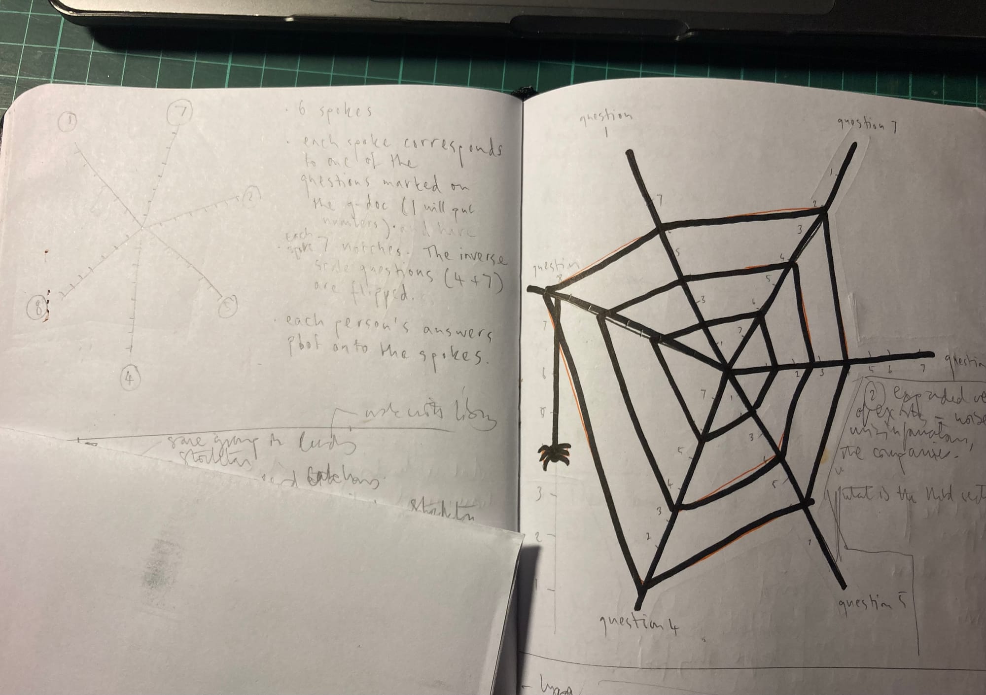
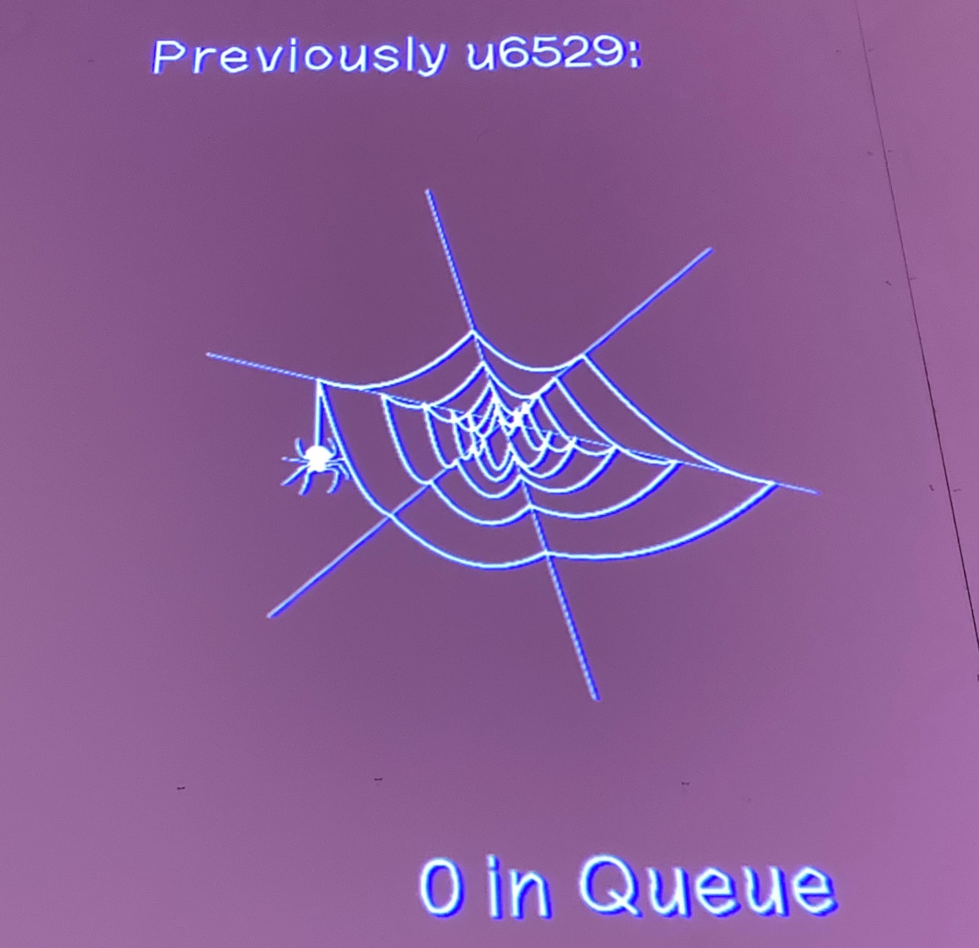
Meanwhile I mulled how best to present people’s ‘diagnosis’ back to them? The NFF aims to bridge divisions on the best approach to climate action, and indeed, people rarely only agree with one perspective. Yet for a satisfying narrative experience, we needed to give people their results. We hit upon the idea of using a spider’s web visual, with each spoke of the web representing one of the statements in the quiz. The more strongly someone agreed with the statement, the further from the centre the spider would draw that part of the web. Statements corresponding to each perspective were positioned next to each other, so the general shape of the web showed how aligned the answerer was to each perspective.
I made some terrible sketches and sent them to Joe and Mirko, who were developing the tech. They started to mock up how it would work computationally, which we were then able to present to the museum at the next deadline. These regular check-ins helped us move forward together, with a shared vision of what the interactive would be and do.
- Test early
Lots of people (especially early in their careers) are really scared of testing early and don't want to show people things until they look beautiful - by which point it is often too late to make changes to core elements. We put the Wild quiz through iterative testing before moving to production. It needed to keep the ‘you are a chocolate digestive’ vibe, leave people feeling empowered to take climate action, and remain thought-provoking. We tested the content in the most ugly format possible - a googleform. We figured that if it was engaging while it looked like that, then we had a solid foundation to build the flashier elements on. The Museum shared the googleform with various stakeholder groups and we sent it out to our group of trusted advisors and critics. We all had access to the feedback, which we asked for through questions in a separate section of the googleform; we were able to quickly take decisions about how to action what people had told us.
We tested the interface Joe and Mirko had been designing before it was connected to the back-end where the data would be gathered. (I came up with the unfortunate metaphor of a toilet which hasn’t been plumbed in yet, but which you can still sit on and… input into.) As ever, we were thinking about access (with a high contrast version available) and simple UI design. (We owe the green language-learning owl a debt of gratitude: Duolingo is really up there when it comes to intuitive user interfaces).
- Let go of things
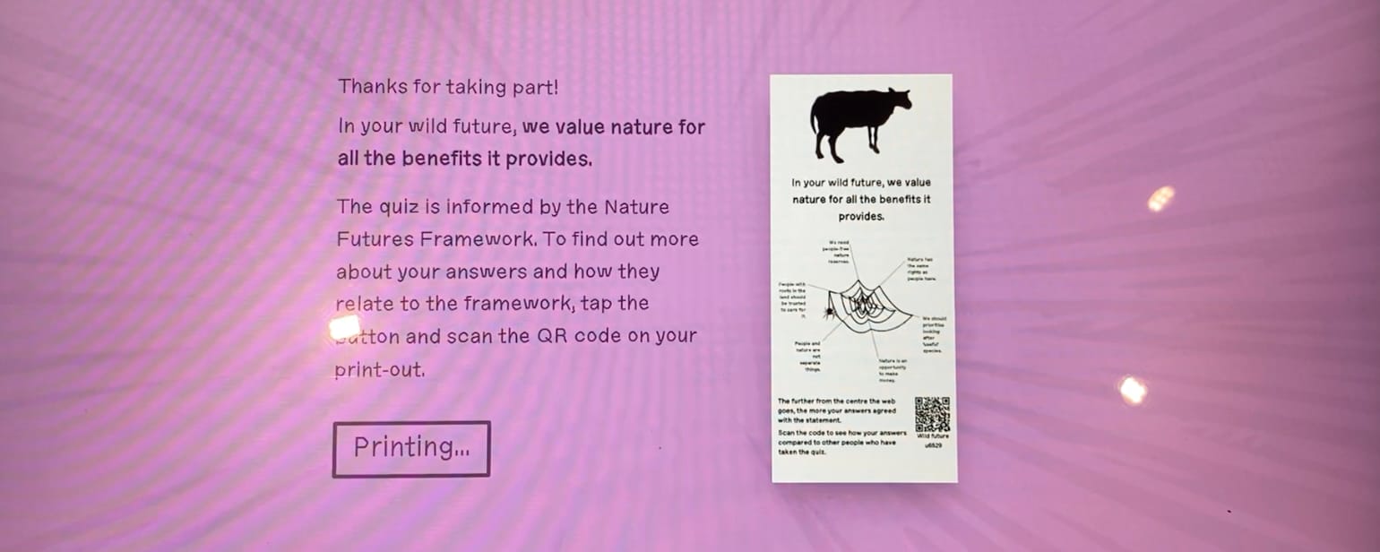
The thing we tested and changed most was the takeaway ticket. The interactive prints you a ticket with your own unique spider web on it. Being able to take your results away enables people to process information at their own pace; a comparison tool on Manchester Museum’s website allows people to see how their web relates to the ‘average’ web.
We’d gone with receipt printers (using eco-roll) which are fast, less likely to jam than other printers, and able to print completely unique tickets for each person. However, what you gain in all these fields, you lose in clarity of printed text. When we tried printing the ticket design that had looked great on a deskjet, it was unreadable. Joe worked wonders with the settings but it became apparent that we’d need to cut the text describing examples of each NFF perspective. I’d spent a long time researching this content and synthesising it into concise, clearly-worded sentences. It got cut.
Equally, Alex and Hannah had spent time coming up with 3 call-to-action questions for the bottom of the receipt, thinking hard about what the final takeaway from the exhibition should be. We’d thought three questions offered a plurality of approaches, so that everyone could find something that resonated with them. They got cut.
There’s something really useful about having an actual physical artefact mocked up. It creates an objective reality which overrides any attachment anyone might have to their earlier ideas. We all agreed on the changes - what we’d previously envisaged just wasn’t working.
- Respect each other’s red lines
Respect is one of those words that gets used a lot in relation to interdisciplinary collaborations or work between organisations of different sizes. It’s hard to say what that actually means, apart from generally being polite. There were a couple of moments in this project when I think a version of respect caused the other partner to go beyond what we’d planned.
Once the interactive (3 podiums, each with their own printer, plus a roving ipad that could print to any printer) was in place, there were new challenges. It was really popular and we were racing through the supplies of receipt paper. Printing all the receipts caused snarl-ups around the interactive - and not everyone wanted to take their receipt, some people were happy to scan the QR code which would take them to their web online. It wasn’t working like Hannah wanted it to. Joe was knee-deep in a new project but we weren’t happy that Hannah wasn’t happy. So Joe wrote a new part of the system which quite simply asked people if they wanted to print their receipt. Lots of people didn’t, and this solved the problem. Why is this respect? Because it’s about seeing it from the other partner’s point of view and understanding that the current situation isn’t workable. I think sometimes respect is acting in the other partner’s interests, regardless of what the contract says you have to do.
Manchester Museum reciprocated this respect. As well as printing each player’s unique web on a ticket (if they wanted), a projection on the wall showed a spider spinning the web, with a unique identifier code, so people knew it was their web being spun. This projection took a while to get right (more on this below). Once it was up and semi-working, Alex and Hannah had some great ideas for ways we might improve it. We were able to implement some of them, but others would just have taken too long. We sometimes had to come back and say no. Rather than pushing back, Alex and Hannah respected that. We were aiming high but we were also being realistic.
What we learned
- The all-important checkback
When I worked in hospitality (waitressing was my main source of income for the first 5 years of my professional life), we were taught to go back to a table about five minutes after we’d delivered the food, to check if everything was ok. Nine times out of ten it was, but on the occasions it wasn’t, it meant you could resolve the issue before it became a problem - the customer would feel they’d been cared for, rather than neglected.
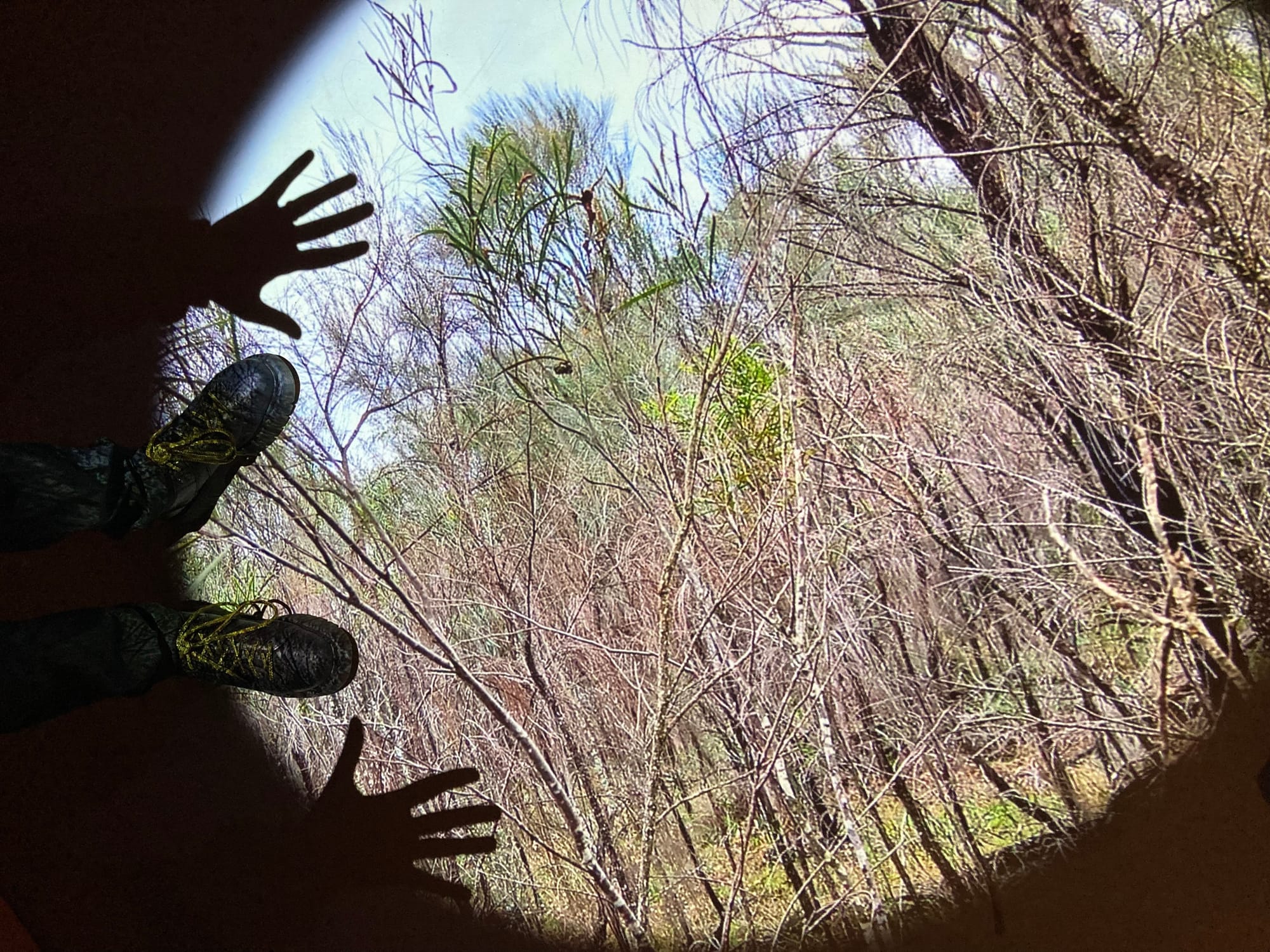
We need to start building in checkbacks to these projects. It’s hard, because everyone is busy and you’re so often straight into the next project, but on this one, not doing a checkback visit was a false economy. There were some issues with the projector, then a new projector, and we tried to adapt the projection remotely. This involved about a thousand emails with poor Oli the venue tech and Joe making adjustments based on guesswork rather than actually being able to see the projection in situ. Next time, we’ll plan and budget for a checkback visit. If nothing needs doing, then it’ll be a nice day trip.
- The more people involved, the longer things take
The beginning of this project was incredibly efficient - streamlined meetings between me, Alex and Hannah, with input from Joe at key points. As the project progressed, more people, like designers, needed to be involved in decisions, and this slowed things down. We’d got into a good rhythm and suddenly everything felt a bit sludgy. I sent lots of ‘just checking if you got my last message’ emails, to people I’d never met, which I hated doing. I knew how busy everyone was getting the exhibition up and that the interactive was a tiny element of it, but I was trying to keep to deadlines we’d agreed. I think the learning here is about allowing more time in the final stages of a project, or pre-empting this by agreeing deadlines with everyone (the hardline option) or being more relaxed (the opposite option). I don’t know what the learning is actually. Maybe it’s just life. Answers on a postcard.
- The value of having a good time/ does it spark joy?
I’m just going to come out and say it: I want to have a fun and interesting time. We don’t do this job because of the stability, guaranteed career progression or fantastically high rates of pay. I do it because I enjoy learning and having ideas and working with interesting people. I came off calls with Alex and Hannah buzzing with excitement for what we could make. Our conversations felt organic and easy. We would spark off ideas the other people had. No one was territorial about their ideas, or let their ego get in the way. We took the piss out of ourselves and weren’t afraid to share bad ideas as starting points. I looked forward to our calls and to hearing what Alex and Hannah would make of work I’d done. I enjoyed working on the project, and would actively seek opportunities to work with Alex and Hannah again.
The older I get, the more I think this enjoyment is important. I’m pretty sure I do better work when I’m having a good time. Sure, there were moments of making tricky decisions, but when that takes place on a background of good times, it feels ok. Life is too short to be miserable - going forward, enjoyment will be one of our criteria for whether we collaborate with a partner.

