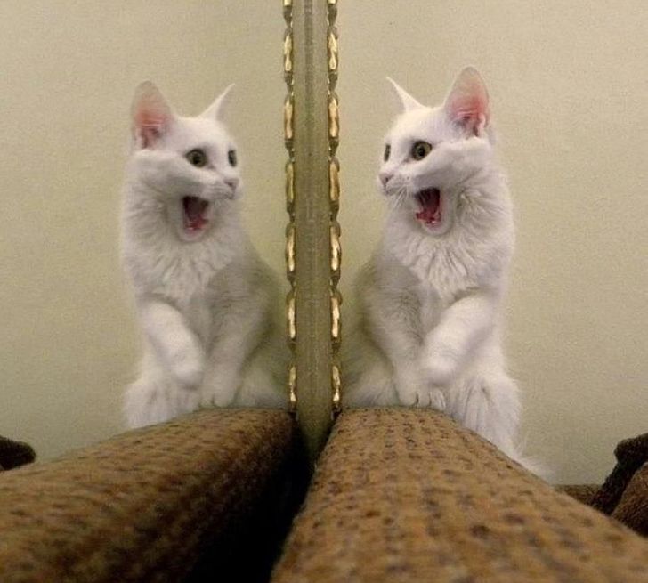
Describe your current appearance in one sentence...
When Rachel chaired a panel recently, she asked speakers to describe their appearances for the audio transcription. It was really hard. Here, she and Al try to unpick why – and how to change that.

Rachel: I recently facilitated a panel on Zoom for a festival. At the start, I asked each of the three participants to introduce themselves, their pronouns and provide a quick description of their appearance as a form of audio-description, since the talk would be captioned and made available afterwards. I gave my own example in my pre-event correspondence to the participants - something like ‘I am a white woman in my 30s, with short blonde hair’. I’d seen a number of talks where people audio-described themselves and it seems to be details like this that are shared.
As I watched the participants audio-describe themselves, I was aware of moments where the formula was inadequate. Age is one - declaring your age foregrounds it in a way that not everyone is comfortable with. One participant joked about the elasticity of the ‘mid-30s’. Another participant, falling into a different ‘decade bracket’ to the rest of us, seemed slightly uncomfortable. Of course, no one was resistant - everyone recognised the need to supply the information that was already available to sighted audience members. But was it? I’m terrible at judging age (I can usually just about do ‘older/ younger than me’) and I don’t think it’s one of the things I consciously notice. I’m much more likely to clock people’s footwear (face to face) or background (on Zoom). But maybe subconsciously I do notice and this affects how I receive what people say…?
For me, describing my ethnicity was simple. It wasn’t for everyone. ‘Mixed-race’ tells a visually-impaired person nothing, meaning that the person has to go through a load of family history and potentially personal information that I didn’t need to disclose. Again, in this context it was fine - the artist describing themselves draws on their personal history in their work and is happy to talk about it in detail - but it felt like another way that language was consolidating ‘white’ as default. I hadn’t thought about that before.
Afterwards, I spent a lot of time thinking about the subtleties of the visual languages we adopt for ourselves and how a clinical, ‘objective’ description probably doesn’t serve us, as it conveys none of those nuances. We’re sending signals with the way we style our hair, our choice of glasses frames, the kind of make-up we wear - or don’t. Two people with ‘short dark hair and glasses’ can look completely different - and perhaps more importantly, actively be sending different messages about who they are. How do we convey this without it turning into a long, narcissistic ode - or indeed a deep-dive into self-loathing for those of us with a complicated relationship with mirrors?
Al: There’s a drag artist/writer/sex worker called Chiyo on Instagram who does great image descriptions when he/they post a selfie:
Rachel: What would it be like if our conference audio-descriptions were more like this, playful and full of humour? I think they’d certainly tell you more about the person than a dry description of age and ethnicity - because we don’t construct our visual selves as if they were a monitoring form, but as clues to the person we are.
Al: I was thinking of some other playful examples from social media - these are all examples where the user puts the image description in the main caption; I don’t use a screen reader so Instagram doesn’t automatically give me the information in the designated alt-text field (there are no doubt all sorts of user-written delights there). Here are some nice ones from curator and writer Kimberly Drew (who I’m pretty sure was adding image descriptions in Twitter posts even back when the character limit was still 140):
Artist and writer Jesse Darling also adds some great image descriptions to their photos:
Jesse’s description on that last image made me think of how Instagram uses artificial intelligence to fill an image’s alt-text field if the user doesn’t manually add something. Ahh artificial intelligence and Silicon Valley social media corps – what famously objective, neutral tools! How we trust them with images of ourselves and others! In the above example, overwriting a racist, sexist, transphobic algorithm that could just detect “blue sky” and then probably misgender you feels exciting – especially if it’s with something as beautiful as “a crazy swathe of turquoise like one imagines the future”. It feels like Jesse’s selfie description captured fragments of their existence in that moment in a way that an AI could only dream of. (Joking – AIs don’t dream, despite what the movies tell us).
Rachel: I’ve heard various people talk about how we can approach access as an artistic consideration - and I guess this is one way. An artistic approach is necessarily subjective, but more and more I think that ‘objective’ ways of approaching things are not objective but actually just most suited to the default powerful culture and the ways that it categorises the world. Without getting too far into this, I feel like there’s a reason that it’s Chiyo, Jesse and Kimberly taking this approach and not Chris (a hypothetical white, male, cis-gendered, banker - oooh look there he is below, just google ‘banker’).

Al: Maybe there are some important differences between creating an Instagram image and an on-stage (or on-panel, or on-zoom) image. With a photo, you can choose the moment you take your camera out, then choose the best from your camera reel, fiddle with it until it’s better (as Chiyo said in the image description for this nude: “Bottom was excessively played with post-capture”), and then you upload to your own corner of the internet, and it stays like that. On a panel, maybe you woke up late and didn’t do your hair, or already spilled coffee down your shirt, or maybe the audience already seems intimidating, or you’re nervous about your IBS playing up during the discussion – all these things can make us much more reticent to draw attention to ourselves as bodies in the space. As much as the ways we see each other are subjective and ever-changing, so too are the ways we see ourselves.
And actually, I think there are some important differences between being on a panel in meat-space, and being on a panel on Zoom. Mainly I'm thinking about how Zoom shows each user their own video by default. It's ironic how well-hidden the blesséd 'Hide Myself' option is (before I was let in on the secret, I was sticking a well-placed post-it note on my laptop screen). I think the problem is best described with a combination of these two posts:
(I don't strike the sexy poses on panel discussions though. Alas.)
So maybe we as facilitators, hosts, organisers, and stage-/screen-sharers could think a little more about how to create a space where declaring your appearance feels more comfortable and fun – not least because those conditions would probably also make for a better panel discussion afterwards. (Sharing the secret of the 'Hide Yourself' option is already your moral obligation as a citizen). I think pre-warning speakers about the question is an important part, and maybe that’s a good moment to set the tone as light and playful. But then, not everyone has the luxury of taking a light and playful approach to their image on demand! There must be more we can do, but what?
Rachel: I don’t think a guide to these self-descriptions exists (a google search didn’t reveal anything) and I would imagine that most people, like me, just copy the approach they’ve seen elsewhere. I think a guide is something we’d like to work towards, or at least contribute to, so that we and others can feel more confident doing this in the future. I don’t feel we know enough yet, so I’d love to hear more from people who use event audio descriptions, or others who’ve audio-described themselves for an event. It seems the world left blog post comments in the previous decade, so hopefully other people can join this conversation on Twitter, or on email. Bonus points if you share your creative self-description…
Al: While I was digging out Kimberly’s posts, I came across something she said last year: ‘My biggest and grandest hope for the future of art is that we really start to think about how to serve communities better. That we’re thinking more abundantly when we draw circles around “community”. That when we’re thinking about Accessibility with a capital A, that we’re thinking about how abundant lives can be, and how we can make spaces that can hold people better.’
To me Kimberly’s words echo in what Jesse wrote just before the above self-description (although admittedly they were probably talking about something else entirely) - “Imagine an escape, an excess, an access”. Self-descriptions are an access, an abundance (but not an excess) that we’d like to imagine - and we’d like to find others who will too. See you on Twitter... 🤞

